Sunlight opens up dark architecture
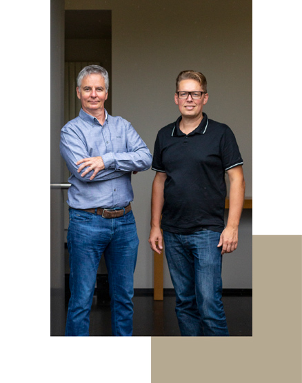
There are few greater advocates for sun protection than Dirk Moerman and Levi Deryckere from Demo+ Architecten. They are committed to ensuring optimum comfort for the people who live in and use their projects, and are therefore fully convinced by the benefits offered by Renson screens. One example of this is at Woning C in Zedelgem, a classic Flemish long-gabled farmhouse that recently underwent a major renovation. We spoke with architect Levi Deryckere about their efforts to achieve optimum daylight with special attention paid to sun protection.
Demo+
Deryckere, Moerman & Partners – Demo+ Architecten – is a dynamic architecture firm comprising six employees who share their experience and expertise in various architectural applications.
Architect and co-director Levi Deryckere explains how they got started: “I began as a trainee with my co-director Dirk (Moerman) who’d already been working in the profession for 15 years at the time. I’ve been working as an architect for just under 20 years myself now, and we’ve spent the last couple of years as Demo+ Architecten. We’re a fairly modest firm, with four employees working alongside the two managers, but we’ve already grown from doing private projects to the more professional market: company premises, public buildings and project development. We mainly work quite locally, within a radius of 30 km from our office in Izegem in South-West Flanders. We’re currently working on the VDL company premises in Roeselare, for example, and for TVH in Waregem.”
“
Large windows blur the boundary between indoors and outdoors ”

Full service
“Our firm’s strength lies in its high level of commitment. We promise very close involvement and monitoring all the way from construction and implementation through to finishing the details… and delivery. We provide a full service and put in a great deal of energy, always endeavouring to deliver buildings that customers are very happy with. Their satisfaction is ultimately our best advert.”
Blurring the boundary between indoors and outdoors
“Daylight is of course very important in contemporary architecture. We use large windows to draw the light in and try to blur the boundary between indoors and outdoors. But you always have to factor in the risk of overheating, which needs to neutralised. That’s one reason why we’ve always been strong advocates of ‘active façades’, which use screens to manage any risk of overheating. Sun protection was our firm’s favourite feature even 20 years ago, as you can see from our office building which we designed and built ourselves: enough daylight, but with sun protection fabric on the outside for when it’s needed.”
Strict on heat protection
“Overheating is a problem that’s often underestimated. Co-director Dirk is always insisting that we pay it enough attention… and rightly so. After all, the customer needs to live in the aesthetic design, and that’s not possible if the indoor temperatures are too high. Screens therefore provide the best solution, and we try to integrate this principle in all our designs. Other companies might avoid using sun protection fabric because of its aesthetic or complexity, but we include it in our design right from the very start.”

Dark architecture opened up
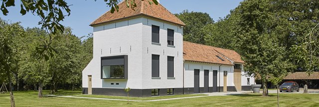
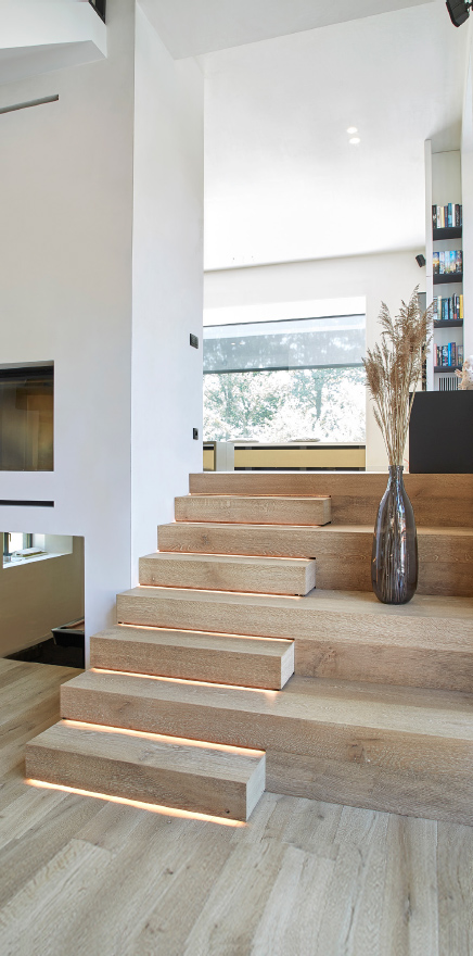
“Woning C is a very good example of how to successfully integrate aesthetically pleasing screens. This building previously consisted of a cacophony of small rooms, but we opened it all up to create a more spacious area under the roof. We also made the small original windows larger and vertical, with a classic touch. And we were able to convince the client about the benefits of sun protection – a combination which in no way detracts from the charm and style of this typical Flemish farmhouse. Woning C beautifully shows how originally ‘dark’ and closed architecture can be opened up with respect for its historical appearance, while still being comfortable to live in thanks to the screens. We’ve successfully reconciled all these issues in this project.”
Window-in-a-box with screens
“Woning C’s ‘window-in-a-box’ feature gives the façade an extra dimension on top of its lovely view of the adjacent historical orchard. This glass window box – south-facing – has been equipped with sun protection fabric, which is especially welcome when it’s as hot as it was last summer. It’s expected that these heatwaves will only become more common in future, so sun protection fabric can have a major role to play.”
Light inside, heat outside
“We favour consistent use of screens in almost all our projects. It’s an established feature of our architecture. To have a healthy building, you first need to be able to keep any excess heat out. Only then can additional technologies be added indoors to improve the living environment even further. It’s also the right choice from an ecological perspective.”
“Woning C is a very good example of how to successfully integrate aesthetically pleasing screens. This building previously consisted of a cacophony of small rooms, but we opened it all up to create a more spacious area under the roof. We also made the small original windows larger and vertical, with a classic touch. And we were able to convince the client about the benefits of sun protection – a combination which in no way detracts from the charm and style of this typical Flemish farmhouse. Woning C beautifully shows how originally ‘dark’ and closed architecture can be opened up with respect for its historical appearance, while still being comfortable to live in thanks to the screens. We’ve successfully reconciled all these issues in this project.”
“
You need to neutralise the
risk of overheating ”
Window-in-a-box with screens
“Woning C’s ‘window-in-a-box’ feature gives the façade an extra dimension on top of its lovely view of the adjacent historical orchard. This glass window box – south-facing – has been equipped with sun protection fabric, which is especially welcome when it’s as hot as it was last summer. It’s expected that these heatwaves will only become more common in future, so sun protection fabric can have a major role to play.”
Light inside, heat outside
“We favour consistent use of screens in almost all our projects. It’s an established feature of our architecture. To have a healthy building, you first need to be able to keep any excess heat out. Only then can additional technologies be added indoors to improve the living environment even further. It’s also the right choice from an ecological perspective.”
Sleep easy
“We use Renson as standard, simply because it ticks all the boxes. For starters, they’re pioneers; their R&D department always leads the way in developing new features while competitors are left behind to catch up. The screens are equally ground-breaking in terms of design, with a minimalist style without any visible screws. We’re very happy with the product quality too, which is important if you want to avoid complaints. And even if there are any, there’s always the manufacturer’s warranty to fall back on. It’s great that both architect and customer can sleep easy. Everything is also very well-conceived with regard to ease of installation, with accessibility from outside. And Renson isn’t afraid to challenge dimensions or find the product’s limits, either. That’s where we really complement each other.”
Integration
“Details are important when it comes to sun protection fabric. The more the sun protection can be directly integrated in the whole, the better. The idea is to conceal it as much and as elegantly as possible, so it’s virtually invisible from the inside when the screens are rolled up. We also pass this message onto the client right from the start, to ensure there’s no issue when it comes to installing the screens later on.”
“
Heatwaves are only going to become more common in future ”
Extending the indoors outdoors
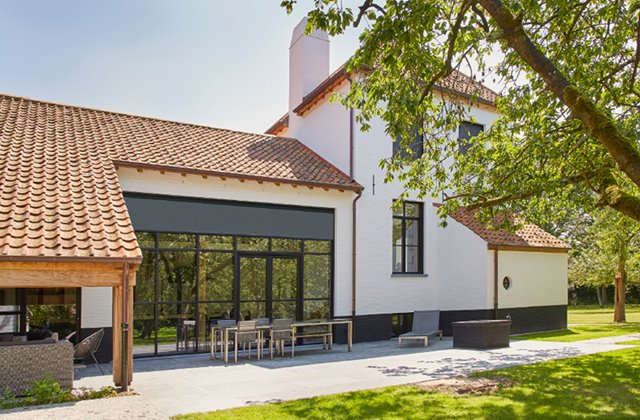
“We’re happy to have large windows where they fit in with the design, and often choose aluminium because it allows you to work in quite narrow spaces right up to the ceiling. We also like to have opening sections in the right places. Where possible, we opt for recessed sills to blur the boundary between the interior floor and outdoors, often installing a covered patio to extend the indoors outdoors as well. Sometimes we extend the screens to this covered patio, too, to form a continuous whole when the sun protection is down, ensuring the covered outside area is integrated as part of the architectural whole.”
Four-seasons patios
“We always try to incorporate ‘outdoor living’ in the architecture if the customer is open to the idea. Then we immediately think how we can connect a covered patio with the home, perhaps joining it to the kitchen or a utility room or living space… which is generally what people want these days. This trend was reinforced by the coronavirus lockdown although it was already increasing in popularity before then. A closable patio also creates additional space, as it does here with the sun protection fabric extending into that area as well, so you can stay sheltered from the wind and use the outside space for longer periods throughout the year.”
Future-proof metamorphosis
“Woning C in Zedelgem underwent a complete metamorphosis. It was a very radical and intensive design, also in terms of following everything up. We were restricted technically because the farmhouse is situated in an agricultural zone but is now residential, which is a different zone. This meant additional building wasn’t allowed and we had to remain within the existing space. The result, which is much more spacious with a lot more light, is very impressive. We’ve opened up the previously cluttered small areas and different levels to make the home future-proof.”
Photos: The Art of Living
