Interplay with light changes the perception of the space
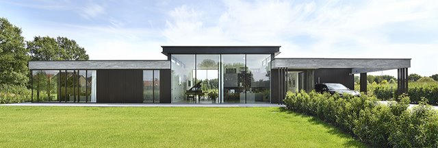
In Nijlen, in the middle of the quiet (Belgian) region of Kempen, there’s a modern villa which was designed by Boxxis Architecten and built in 2018. Renson is strongly represented in this design, with clean lines and plenty of light in and around the building thanks to the Fixscreen sun protection, Sunclips awning, Linarte façade cladding and an Algarve patio cover on the pool house. Architect Wijnand Thomassen explains his inspiration, the interplay with sunlight, and the use of Renson products in his work.

Boxxis Architecten
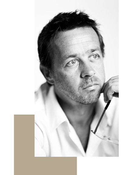
“Boxxis Architecten is a full-service architectural firm,” begins Wijnand Thomassen. “The name Boxxis is a reference to the expression: ‘thinking outside the box’. That means thinking beyond the normal standard… thinking together with the customer… which is something we excel at and what our architecture is all about. We started in 2002 and have now been focusing on a wide range of design assignments as a compact organisation for 20 years. Our wide variety of projects – from small-scale residential work to large-scale apartment complexes and commercial buildings – has helped us develop a broad range of expertise in urban planning, architecture and interior architecture. Whether it’s a home or an office, we’re always inspired to expand our knowledge and vision further. Efficiency, flexibility and decisiveness are the cornerstones of our firm. We welcome large-scale and complex projects, and enjoy thinking proactively to a very fine level of detail together with clients, possibly in collaboration with partners from our wide network. This allows us to make the best use of our know-how and skills, and keep them up to date.”
“Boxxis Architecten is a full-service architectural firm,” begins Wijnand Thomassen. “The name Boxxis is a reference to the expression: ‘thinking outside the box’. That means thinking beyond the normal standard… thinking together with the customer… which is something we excel at and what our architecture is all about. We started in 2002 and have now been focusing on a wide range of design assignments as a compact organisation for 20 years. Our wide variety of projects – from small-scale residential work to large-scale apartment complexes and commercial buildings – has helped us develop a broad range of expertise in urban planning, architecture and interior architecture. Whether it’s a home or an office, we’re always inspired to expand our knowledge and vision further. Efficiency, flexibility and decisiveness are the cornerstones of our firm. We welcome large-scale and complex projects, and enjoy thinking proactively to a very fine level of detail together with clients, possibly in collaboration with partners from our wide network. This allows us to make the best use of our know-how and skills, and keep them up to date.”
“
The way the room is lit is essential for making the best
use of the space ”
Nationwide with excursions to neighbouring countries
Boxxis Architecten is based in Barneveld in the Netherlands, where Thomassen was born and raised. “After spending some time working in Amsterdam, I wanted to set up on my own so I returned to my roots where I have a large network of contacts. And I’ve never regretted that decision. We operate all over the Netherlands from here and occasionally enjoy visiting neighbouring countries for projects. We’re currently working on a project in Germany, for example, close to the Polish border. But these foreign excursions are more an exception than the rule. And 70% of our Dutch projects take place close by in our region.”
People, moving through space
“A photo of one of our employees in front of the office staircase under the skylight sums up our architecture for me: it’s all about people, moving through space. The perception of space is dependent on light, and the way the room is lit is essential for making the best use of this space. We play with this light and, in turn, how the room is experienced. Spaciousness, lines of sight and lighting are all extremely important themes for us.
Changing perception
How a space is perceived can change depending on the daylight it gets, which is something we want to consider carefully and play with. This also relates to comfort. Light, air and space were important themes in the 1920s, especially with regard to people’s health within their homes. And that’s still very much the case today, of course.»
Light and health
“Light is an important issue when it comes to health and comfort. Light and heat are becoming more important by the year, as are the answers to the questions: how does light enter the room? And how does that bring in heat? Our architectural training taught us to have as much south-facing glass as possible because ‘it’s what people like’. But that’s evolved now, and even though light entering from the south is still appreciated, excessive heat isn’t. This problem also relates to sustainability: how do you ensure a good energy balance at home while retaining the right interplay with light?”
Light without heat
“Clients insist that homes should have plenty of light and sunshine, and all kinds of systems have been developed to ensure the right temperature. There has, however, been a trend towards more architectural solutions in the preliminary design recently: deeper coves, smaller glass surfaces, overhangs, sun protection in the form of landscaping… Sun protection would actually be the ‘last resort’ in this perspective, but it can of course also have an aesthetic quality.”
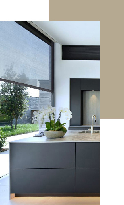
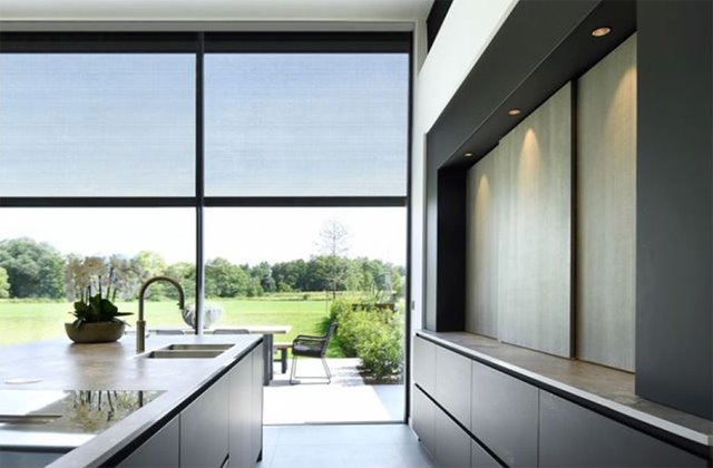
“Opting for Fixscreen was a question of aesthetics in the Nijlen project. We didn’t want to compromise the wonderful view and large glass sections at the rear of the building. So we weighed up the balance of interests in the design and quickly settled on sun protection screens. This ensured we could retain the large glass surfaces, fantastic views and connection to nature, with the screens in place to block heat from the sun when needed.”
Functional and invisible
“It boils down to the details. You want to avoid seeing sun screens wherever possible, especially when they’re not required or on a side of the building where they don’t always have to be down. We usually make sure they’re hidden as much as possible when they’re not serving a function, which means concealing them in the construction in practice.”
“Clients insist that homes should have plenty of light and sunshine, and all kinds of systems have been developed to ensure the right temperature. There has, however, been a trend towards more architectural solutions in the preliminary design recently: deeper coves, smaller glass surfaces, overhangs, sun protection in the form of landscaping… Sun protection would actually be the ‘last resort’ in this perspective, but it can of course also have an aesthetic quality.”
“
Screens do not compromise views and large windows ”
“Opting for Fixscreen was a question of aesthetics in the Nijlen project. We didn’t want to compromise the wonderful view and large glass sections at the rear of the building. So we weighed up the balance of interests in the design and quickly settled on sun protection screens. This ensured we could retain the large glass surfaces, fantastic views and connection to nature, with the screens in place to block heat from the sun when needed.”
Functional and invisible
“It boils down to the details. You want to avoid seeing sun screens wherever possible, especially when they’re not required or on a side of the building where they don’t always have to be down. We usually make sure they’re hidden as much as possible when they’re not serving a function, which means concealing them in the construction in practice.”

Aesthetic awnings
“The Sunclips awning systems – at the rear of the building in Nijlen – are highly visible and have a clear aesthetic quality. In this case, you want them to stand out, which is why you always need to weigh up the right balance in the overall design. We also definitely want to avoid someone adding screens or awnings at a later date, because it would be too late to incorporate them properly at that stage. The overall design needs to take all this into account and integrate them right from the start.”
Extra indoor space outdoors
“To a large extent, awnings create additional outdoor space. Movable blades ensure you have an area where you can sit undercover or in the open air depending on the weather. “Screens do not compromise views and large windows” But this is more to do with how the space is perceived and the indoor/outdoor experience than effective sun protection. These adjustable roof blades make the space more like a veranda, and the whole system was also a direct consequence of Belgian building regulations. We’re familiar with zoning plans in the Netherlands, too, which mean you can only add or extend a limited number of square metres. These regulations include closed patio coverings, but not pergola-like structures. That’s why we quite often use bladed roofs, for example on the carport and Algarve patio cover for the pool house in Nijlen. It’s great that we were able to match the materials and colours in the process there, as we could for the screens too.”
Rhythmic code
“The villa in Nijlen is quite a simple concept, with the brick ‘roof’ rising up out of the Belgian clay in places. The remainder is a light infill, with steel columns and frame posts appearing in a particular rhythm. The Linarte façade cladding also fits in with this vertical rhythmic sequence of framed column cladding, which looks a bit like a metal barcode between the ground and the brick border.”
Solutions
“We’ve often worked with Renson before. I think they’re one of the better and more well-known sun protection brands. I particularly remember the ‘tricky’ window dimensions from the project in Nijlen. We wanted to hide the screens’ side guiding channels as much as possible but everything still had to be technically sound, and fortunately we had the skills to find a good solution.”
Open project
“The project for the home in Nijlen took place in 2018 and was a great success. It was a fantastic opportunity for us, which we grabbed with both hands. The clients – a couple who wanted to build their dream home – had already approached five other Belgian architects, who all proposed a more closed solution, before they came to us. Our design had all the living areas on the ground floor, and provided space for being together, relaxing, exercising and even working. We were the first to opt for more openness and therefore used a lot of glass. We kept both the public road and neighbours at a far enough distance so that curtains and shutters weren’t necessary. That’s what really made us stand out and helped us win the contract. The dilapidated former farmhouse has now been replaced with a modern villa, a complete project in which we also designed the interior space. People are always more than welcome to come to us for projects like this.”
Photos: The Art of Living
“The Sunclips awning systems – at the rear of the building in Nijlen – are highly visible and have a clear aesthetic quality. In this case, you want them to stand out, which is why you always need to weigh up the right balance in the overall design. We also definitely want to avoid someone adding screens or awnings at a later date, because it would be too late to incorporate them properly at that stage. The overall design needs to take all this into account and integrate them right from the start.”
Extra indoor space outdoors
“To a large extent, awnings create additional outdoor space. Movable blades ensure you have an area where you can sit undercover or in the open air depending on the weather. “Screens do not compromise views and large windows” But this is more to do with how the space is perceived and the indoor/outdoor experience than effective sun protection. These adjustable roof blades make the space more like a veranda, and the whole system was also a direct consequence of Belgian building regulations. We’re familiar with zoning plans in the Netherlands, too, which mean you can only add or extend a limited number of square metres. These regulations include closed patio coverings, but not pergola-like structures. That’s why we quite often use bladed roofs, for example on the carport and Algarve patio cover for the pool house in Nijlen. It’s great that we were able to match the materials and colours in the process there, as we could for the screens too.”
“
Light infill with rhythmically recurring elements ”
Rhythmic code
“The villa in Nijlen is quite a simple concept, with the brick ‘roof’ rising up out of the Belgian clay in places. The remainder is a light infill, with steel columns and frame posts appearing in a particular rhythm. The Linarte façade cladding also fits in with this vertical rhythmic sequence of framed column cladding, which looks a bit like a metal barcode between the ground and the brick border.”
Solutions
“We’ve often worked with Renson before. I think they’re one of the better and more well-known sun protection brands. I particularly remember the ‘tricky’ window dimensions from the project in Nijlen. We wanted to hide the screens’ side guiding channels as much as possible but everything still had to be technically sound, and fortunately we had the skills to find a good solution.”
Open project
“The project for the home in Nijlen took place in 2018 and was a great success. It was a fantastic opportunity for us, which we grabbed with both hands. The clients – a couple who wanted to build their dream home – had already approached five other Belgian architects, who all proposed a more closed solution, before they came to us. Our design had all the living areas on the ground floor, and provided space for being together, relaxing, exercising and even working. We were the first to opt for more openness and therefore used a lot of glass. We kept both the public road and neighbours at a far enough distance so that curtains and shutters weren’t necessary. That’s what really made us stand out and helped us win the contract. The dilapidated former farmhouse has now been replaced with a modern villa, a complete project in which we also designed the interior space. People are always more than welcome to come to us for projects like this.”
Photos: The Art of Living
